Tamagui and Expo, Write Once, Run Everywhere?
Using Tamagui for your Expo apps, what it offers out of the box, and how it will improve your developer experience.
Introduction
As a React Native developer, I've found that a lot of the UI libraries out there lack a lot of key components needed by a production-ready application. In this article, I'll be introducing you to Tamagui, a cross-platform UI kit that offers every component you'll need not just to ship your app to production but ship it with a great-looking UI.
What is Tamagui?
Tamagui is a UI kit created by Nate Weinert built for React Native and the web. Tamagui was created on the idea of making the development of cross-platform applications easier and faster for small teams, by making sure that a majority of their code can be shared across all platforms. It can be used in both Expo and Next.js applications, allowing you to share component code and styling between native and web applications. Tamagui offers a wide range of native and web components such as buttons, switches, stacks, inputs, sheets and more. However, it offers a whole lot more than just a nice component library, it also has its own compiler that flattens your component trees and modifies your styles to best fit whichever platform your application is running on.
The initial inspiration for Tamagui was a social food discovery and listing app that Nate was working on during the pandemic. He needed a well-optimized and fully featured component library that offered all the components the app needed out of the box. With his experience in building dev tools and a little bit of style inspiration from the jsxstyle package he got to building, and not long after, Tamagui was born.
You might be thinking "This is great and all but is it safe to use?". That question and more will be answered in the coming sections.
Is Tamagui production ready?
Yes, Tamagui is production-ready. This is a question that gets asked almost every day in the Tamagui community discord, and yes, you can ship Tamagui to production with no worries. Here are 2 examples of apps using Tamagui in production:
Commented.io - Next.js Web App
Tidus Wallet - Expo Mobile App
Why I use Tamagui over any other library
With the number of components Tamagui has I find it hard for any other component library to beat. As a software developer who has used libraries such as glustack-ui(formerly NativeBase), React Native Material, React Native Paper and more, believe me when I tell you that none of them match up to Tamagui. Below are more points on why Tamagui is my go-to component library.
Ease of use
Styling and theming your application is easy with tamagui. Don't just take it from me, here's what a community member had to say about it
You wont need to think about making your app appealing, the app is appealing off the bat - Hossam
To use Tamagui in your Expo application all you need to do is install it!
npm install tamagui @tamagui/config
Once you have it installed, create the Tamagui config file in the root of your project.
// tamagui.config.js
import { config } from "@tamagui/config"

import { createTamagui } from "tamagui"

const tamaguiConfig = createTamagui(config)

export default tamaguiConfig
Now, all that's left is to add the TamaguiProvider component to the root of your Expo application.
// _layout.jsx or App.jsx
import "@tamagui/core/reset.css"
import { TamaguiProvider } from "tamagui"
import config from "./tamagui.config"

export default function App() {
    return (
        <TamaguiProvider config={config}>{/* your app here */}</TamaguiProvider>
    )
}
And that's it! You're good to go. Keep in mind that with this quick config, you'll be using the Tamagui default theme. In order to change it to your liking check out the full config guide.
Note: Depending on if you're using Expo router or not the root of your application will be different. If you're using Expo router, add the provider to your root _layout.jsx file. If you are not using Expo router adding the provider to your App.jsx file should be fine.
Here's a little code snippet of how easy it is to create and style components using Tamagui:
import { Input, Paragraph, Separator, XStack, useTheme } from "tamagui"
import { useToastController } from "@tamagui/toast" // you'll need the @tamagui/toast package
import * as Clipboard from "expo-clipboard" // you'll need the expo-clipboard package

export default function Example() {
    const toast = useToastController()
    const theme = useTheme()
    const [value, setValue] = useState("")
    const placeholder = "Type something"

    return (
        <XStack separator={<Separator vertical alignSelf="stretch" />}>
            <Input
                style={{ width: "75%", paddingRight: 10 }}
                fontSize={"$5"}
                multiline
                lineHeight={"$4"}
                borderWidth={0}
                placeholder={placeholder}
                backgroundColor={"$colorTransparent"}
                value={value}
                onChangeText={setValue}
            />
            <Paragraph
                lineHeight={"$4"}
                fontSize={"$5"}
                selectable={false}
                style={{
                    padding: 16,
                    color: theme.blue10.get(),
                    flexWrap: "wrap",
                    flex: 1,
                }}
                onPress={() => {
                    Clipboard.setStringAsync("Seperate text")
                    toast.show("Copied", { native: true })
                }}
            >
                Seperate text
            </Paragraph>
        </XStack>
    )
}
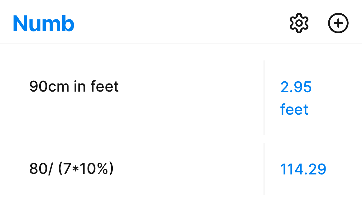
This is a code snippet from the Numb app. The above code snippet will render the input fields in the below image.

Flexibility
Customization is super easy with Tamagui. In React Native you can make use of the normal style property or you can make use of the components styling props, like I did in the previous code snippet. Tamagui components also have a className prop in case you're using it on the web and you prefer using that.
Tamagui also offers a few frequently used HTML elements such as Footer, Header, Nav, Main etc. And yes, they do inherit the styling props that other Tamagui components possess.
Creating styled-components is also pretty easy by making use of the styled function.
import { Stack, styled } from "tamagui"

const MyStack = styled(Stack, {
    name: "MyStack",
    backgroundColor: "$background",
    padding: "$8",
    borderRadius: "$12",
})
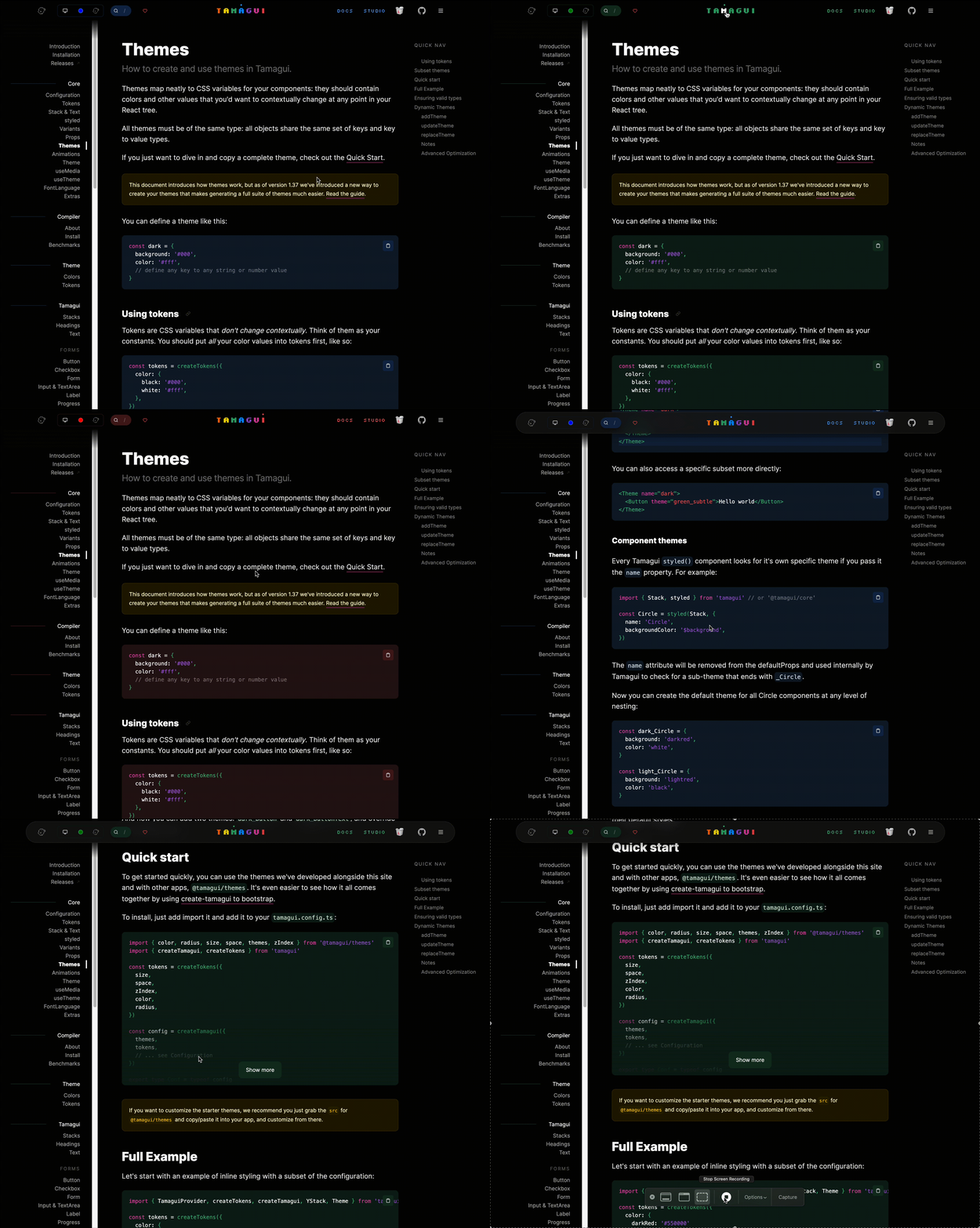
And the most flexible and customizable part of Tamagui would be the themes. Theming in Tamagui is way out of the scope of this article, just with how much you can customize. However, here's a peek at just how customizable it is using their docs website as an example.

Vast number of components
In the React Native ecosystem, Tamagui is one of the only UI libraries if not the only that offers everything that you need (component-wise) to build a production-ready application from start to finish, with everything from Toasts, Theming, Modals, Sheets and more, all packaged and ready for you to use. Other React Native UI libraries offer a few of these components out of the box, but why not all? That's a question that I have asked myself over time and time again 😕.
Here's a list of some of the components that I have used and see myself continuing to use in the future:
Stack - my most used
Toast - has native support out of the box
Tooltip - underrated but highly utilized
Sheet - one of my favorites
Switch - good for settings and keeping everything themed
ToggleGroup - same as the Switch component
Select - makes implementing native select menus a breeze
Input & TextArea - easy to style and automatically themed
Button - has icon support out of the box 😱
LinearGradient - in React Native it's really hard to implement Linear gradients properly, this makes that easy
Card - a convenient card component styled out of the box
Sustainability and Support
Something that I've started looking into as I have progressed in my journey as a software engineer is project sustainability. Before using a project I like to ask a few questions:
Is this project sustainable?
Where do I see this project in the next 2 years?
Are the founders and maintainers going to abandon the project in any way?
What is keeping this project alive? (Is it just running on vibes and inshallah?)
I ask these questions in order for me to make a well-informed decision on whether I want to commit to using the library, package or whatever it may be in my project. I'm sure a lot of us have been in a situation where we've needed to refactor almost 50% of a project just because one of the dependencies has been deprecated or completely overhauled 😡. If you haven't, then trust me when I tell that it isn't fun.
I have found that Nate and the rest of the Tamagui team have thought about these same issues, and have put a few things in place to make sure that Tamagui is sustainable and stays well-maintained. One of the things that they are currently working on is Studio, which is a visual editor that gives you the ability to create and theme your components while generating the code for those components. Studio is going to be a SaaS that supports the development of Tamagui through the revenue it generates.
Conclusion
In conclusion, I highly recommend trying out Tamagui in your next Expo project or Next.js project if you would like to use it for the web. Development is not going to stop any time soon and the community is growing day by day. If you would like to contribute, check out the repo on GitHub and join the discussion on the official discord. It's one less overhead, just use Tamagui 😁.
I hope you enjoyed reading this article as much as I enjoyed writing it. If so, please don't forget to share and follow me on X. Thanks for reading, I hope you don't miss the next one.